Wednesday 6 April 2011
Evaluation Powerpoint
This is my evaluation powerpoint which i uploaded through slideboom! There is also a recorded version of my evaluation
Tuesday 5 April 2011
Friday 18 March 2011
Monday 14 March 2011
Monday 7 March 2011
TOC and selected images
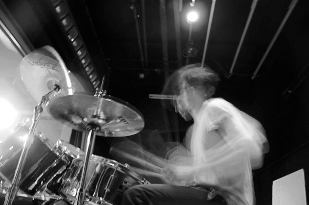
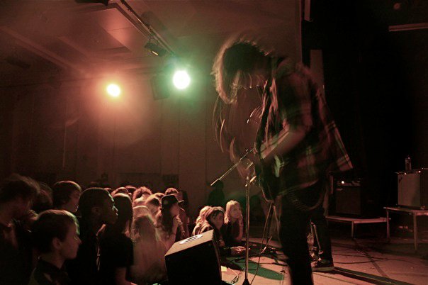
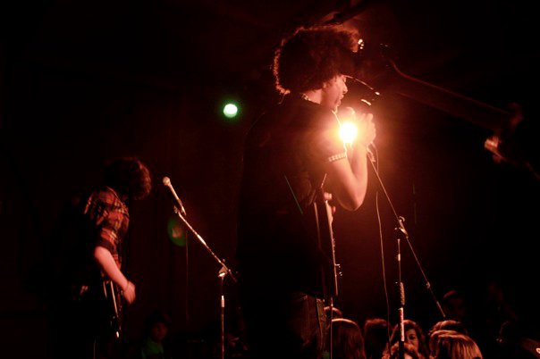
Here are a selection of images for my TOC. i am going to only choose 5 final images.


I wanted to have a range of images from live concert photograpghs to landscape shots, so i took advtange of the fact i was going to New York. I thought having landscape shots made my magazine look more sophisicated and made it look more professional rather than having a group of my friends pose towards the camera. I think these images worked in my TOC as i was later on in the progress of my magazine i was aiming for it to look like a up market magazine.
TOC
For my TOC i pushed the conventions of a music magazine and followed the conventions of a more up market magazine. I decided to make my TOC a double page spreed as i wanted to use all my images.
First page:

I used the same red as i used in my front conver and DPS to show that they all link together and also decided to use an image of my model for the whole page as i wanted to highlight she was the main feature in my magazine. I used to white clear text in both pages to keep it simple and minimal and not to take anything away from my images.
Second page:

With my second page i used my selected images to illistrate my information. A range of images from live concert shots to landscape photographs.
Monday 7 February 2011
Tuesday 25 January 2011
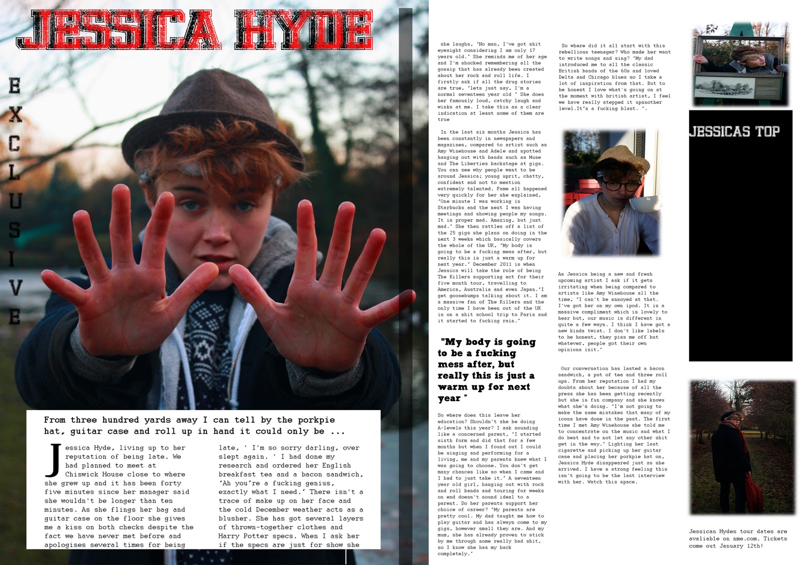
Inspiration for DPS
I saw this article in NME magazine and the image that covered the whole page really caught my eye. This helped me finalize my decision of using one image to cover the left hand side of my DPS.


Also with NME the usally use journalisitc interveiws which i think personally work much better than Q&A as it gets the readers to feel as if they are with them and get more of an insight to who the artist really is.
Subscribe to:
Posts (Atom)