First Draft:

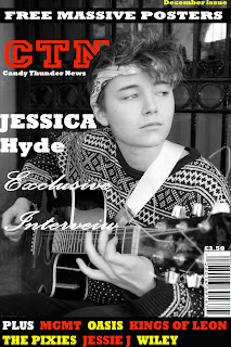
The first draft of my magazine i was going for the really conventional music magazing look, following the format of NME and Kerrang. I did this by using bright colours as my colour schemes, lots of coverlines and buttons.
Second Draft:
If i wanted my magazine to look professional i needed to change my magazine cover. As my portrat image was black and white i decided to just use one coverline and use white font for it ( Palace Script MT ). The font reminded me of a signature and i thought it could make it look more personal. I took away the button and the coverlines and the poster picture to try and go for a more minimlistic approach.
Third Draft:

I started to get more inspiration from magazines such as I-D, Dazed and confused and The gentlewomen. To follow this convetion i only used ; her name in Palace Script Mt, barcode and the masthead. Even though my model isn't looking towards the camera ( a common convention even with magazines who don't conform to the common conventions ) the bright red masthead makes it an even balance so it will still catch the readers eye.


I started to get more inspiration from magazines such as I-D, Dazed and confused and The gentlewomen. To follow this convetion i only used ; her name in Palace Script Mt, barcode and the masthead. Even though my model isn't looking towards the camera ( a common convention even with magazines who don't conform to the common conventions ) the bright red masthead makes it an even balance so it will still catch the readers eye.


